Whittaker’s Packaging
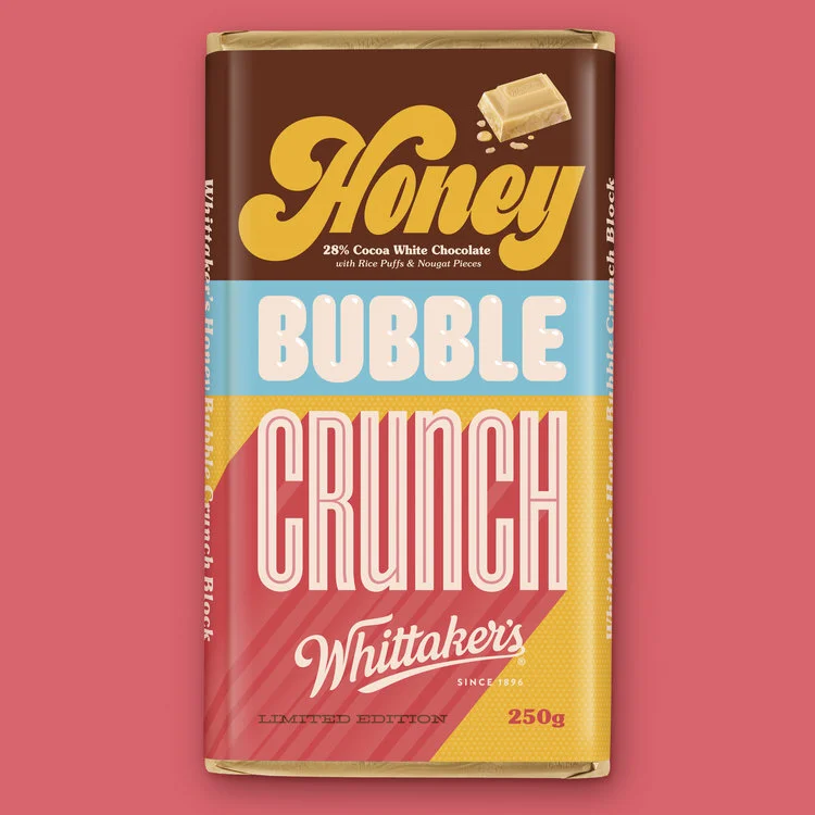
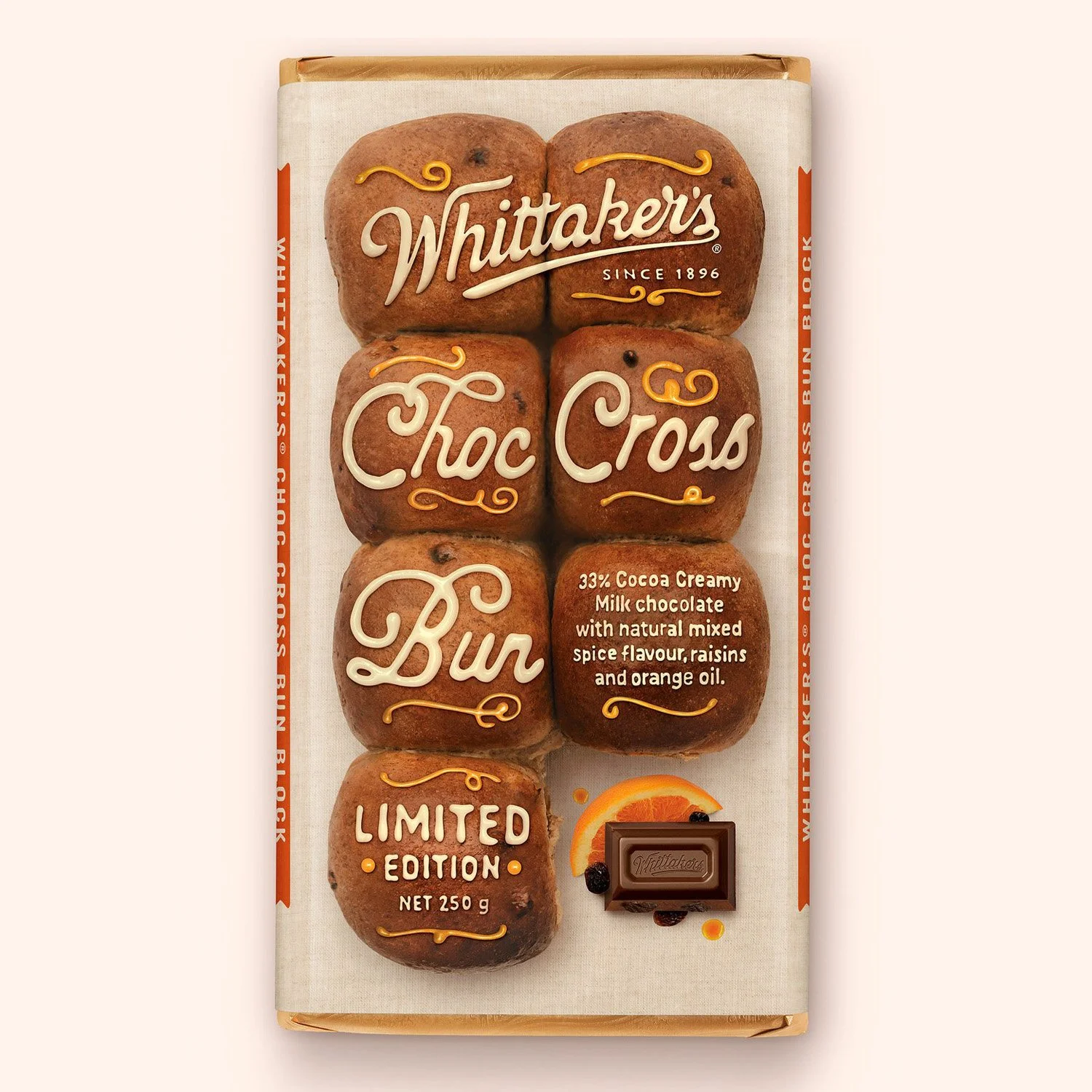
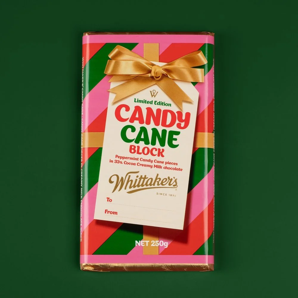
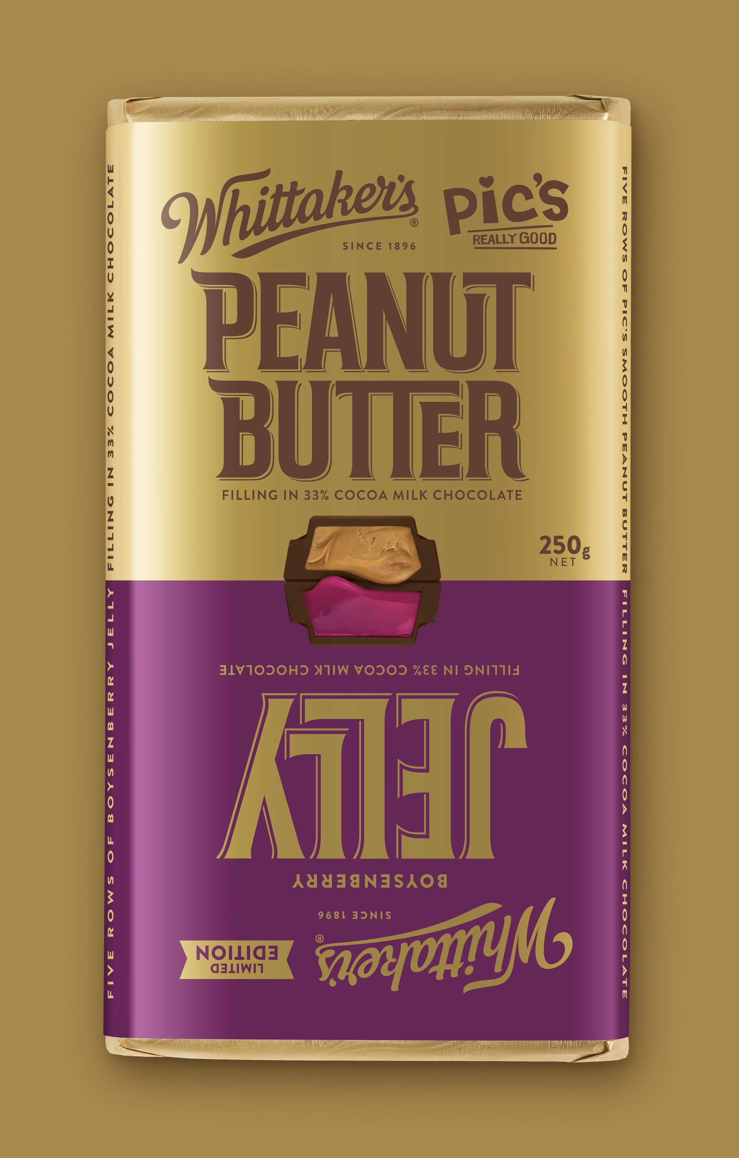
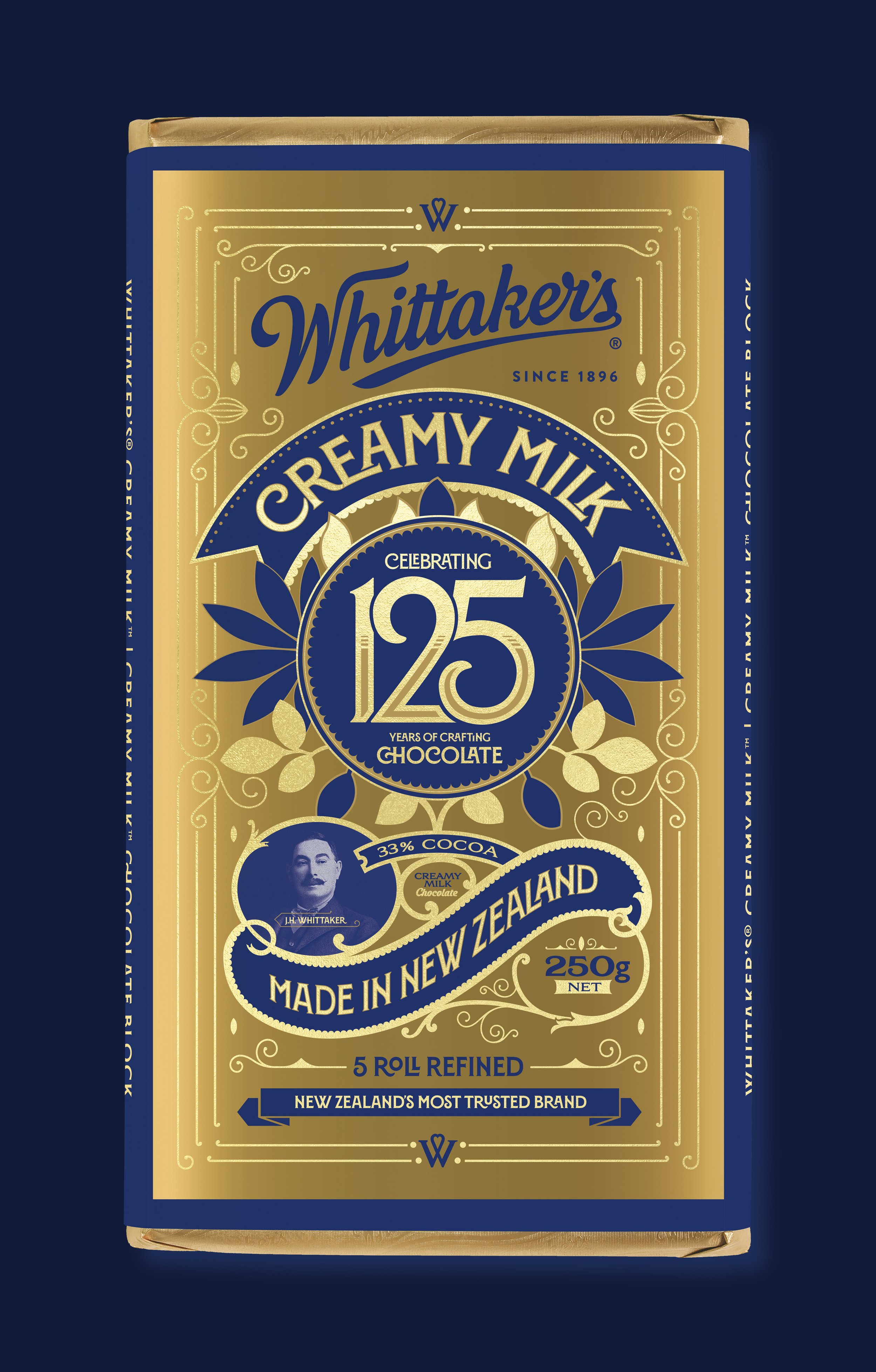
Typography plays a clear, functional role across Whittaker’s packaging, helping each product communicate flavour, hierarchy and brand with confidence and consistency. It works alongside illustration, photography and colour to ensure information is immediate and easy to read, even on a crowded shelf at the supermarket.